Monday, December 14, 2015

Something I Never Got to Say


My thing I never got to say was "broken can be whole." I displayed this by taking the features of the face and drawing them separately. They had originally been on a white piece of paper, but it looked too empty so I decided to make a print in the blank space. Needless to say, I ruined it. I ended up cutting the features out and putting them on the black piece of paper, as shown.  

Friday, December 4, 2015

Art Museum


This painting called Madonna and Child in a Landscape is one of the paintings that I changed my mind about. I hated it when I first saw it, but after I stared at their repulsive let small and misplaced faces, I began to like it more. I also like the coloring of the skin and hair texture. 

This blue square painting is THE ABSOLUTE WORST PIECE OF ART IN THE WORLD. An empty trash can would have more meaning. Anyone can paint a blue canvas, and after hearing the artist talk about it I hated it even more. It's not art, it's a math project. There's no depth or meaning to the piece, let alone an interesting composition. Disgusting.

This painting is one of my favorites that I saw. There was so much detail and it looked so realistic. The sky is really beautiful, too; the way it sort of fades into clouds and how the light source is coming from behind the thing on the left is really nice. I like how simple yet beautiful this piece is. 


Friday, November 20, 2015

Non-Traditional Materials

I used lipstick and eye/lipliner for my non-traditional medium and drew fall leaves. I chose lipstick because it's one of my favorite things, and I picked leaves because I thought the colors of lipstick would work well. I like the final product, but I wish it had some yellow. I used a gold eyeliner for the orangey leaves, but I would have liked a strong yellow. 

My favorite leaves are the dark ones; the color is really rich and beautiful. 


Thursday, October 29, 2015

Post Modern Principles Project


I chose appropriation for my principle and recreated a "self portrait" I did from elementary school. I didn't try to make it accurate, I just wanted to get the gist of the piece. I chose this because 1) I needed something to do, and 2) I found this picture when I was cleaning my room and thought it was really funny. I liked the idea of remaking something that I already did and thought this would be a good piece. I don't like the way it turned out, but it was already done so I went with it. 

Wednesday, October 21, 2015

The Best Art Supply Store Doesn't Sell Art Supplies

I agree that some of the best art supplies can be found in places like hardware stores. There are plenty of great non-traditional supplies to use, but I also think that the best pieces come from using both non-traditional and traditional media. Things like paint can be difficult to replicate, and when combined with more creative supplies like rice, trash, or Cheetos can make a really awesome and creative piece.

Friday, October 9, 2015

Post Modern Principles

Reading the article by Olivia Gude, I agree with a lot of what she's saying. There is a disconnect between what we learn and the projects we do because most of the lessons are focused around warm ups. When we learn techniques or principles, we practice them in our sketchbooks before moving onto our projects about essential questions, adjectives and what have you. Up until this year, I don't think I ever really learned the principles of art and things like that (which I don't necessarily think is a bad thing), but I think that we should apply what we're being taught to out projects. 

Wednesday, October 7, 2015

Can light create darkness?

My essential question for this project was if light can create darkness. I chose this because 1) I couldn't think of anything better, 2) because I like the idea/challenge of capturing light in a painting, and 3) because I wanted to combine the ideas of cold, loneliness and light. (My original question was about cold.) I found a picture of a street lamp on the side if a building for inspiration and decided that besides tweaking a few things, I would use that picture. I ended up changing my mind after doing the back ground, and decided to just do a single light bulb. I like the way it turned out, and I think it's one of my favorite pieces that I've done. 

Original reference picture:

Final product:

Thursday, September 17, 2015

Art Without Meaning is Decoration

I think I agree that art without meaning is decoration, but I'm not completely decided. On one hand, I feel like art is sort of meant to be decorative; on another hand, I think that people often use art to express themselves. I think any art can be decoration, even if there is meaning. 

Thursday, September 10, 2015

Elements of Art


I did a portrait of Audrey Hepburn to show the element of value. I used both graphite and charcoal; I am more comfortable with graphite but I used charcoal to get darker value. To begin, I used a grid that allowed me to do an outline of the drawing. I then added the details and some light value to build on. I wasn't careful enough with the grid and ended up with a nose, eye, and jawline that didn't match what I was going for. I also had trouble getting enough value. I couldn't get as dark as I wanted with the graphite so I used charcoal, but I had issues with putting the charcoal on top of the graphite. It gave a grainy, uneven texture that I did not like, and erasing didn't help. Overall, I am indifferent to the final product. I like everything but the face (save the eyebrows), but as a whole I'm not impressed.

Thursday, May 28, 2015

Final Project

For this project I chose acrylic and graphite. I like sketching in pencil and am best at shading and creating depth with pencil, and I find it easier to create a dripping effect with acrylic paint. The background was also too big for me to do with marker or sharpie, so I chose black paint for a darker and more opaque color. Having both the graphite and acrylic gave me more contrast and allowed me to show the light and dark of depression more easily. This was a surrealism project, but I still wanted to make a statement so I chose something creepy (a mask) and used the blood to show the pain and the leaking. Had I used acrylic for the shading in the mask, I would not have been able to get the shadows the way I wanted them and if I had used graphite pencil for the background I would not have been able to get the deep, dark black color to represent the emptiness that comes with depression. The mask idea came from the fact that for a lot of people, hiding their depression behind a "mask" of happiness is easier because they don't want anyone to know what's wrong or to upset their family and friends. I think that this piece is really successful. It conveyed the message that I wanted it to with an eerie emptiness. The piece in general also looks pretty good and is neat and put together.


I picked just acrylic for this piece because it is one of my favorite mediums to use. In this art work, I tried to show that even though the world is separate and we (humans) are all different and come from different places, we all have the same roots and need to work together to make the world a better place. Using acrylic helped me to convey the message by allowing me to use a lot of layering and blending to create depth and mix/blend the colors easily. I initially used black for the continents, then went in with a dark green. I then mixed the dark green with a lighter green and was able to sort of highlight the center of the continents. I was also able to give the tree more depth and dimension by adding blacks and dark browns to the lighter browns to create shadows. I think that this piece was very successful. I was able to convey the message I wanted to successfully (though maybe not obviously) and depict it in a way that I liked and showed some of my best art skills.


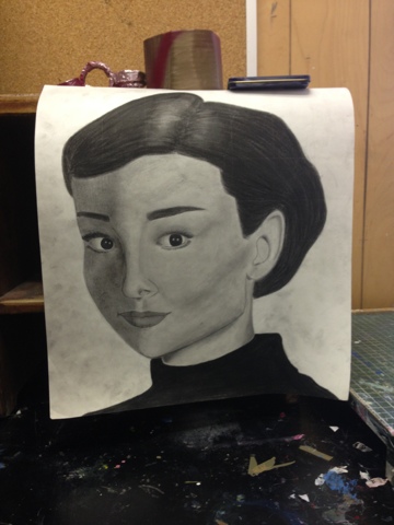
I really enjoyed the portrait unit, even though I did not at first. It was challenging, but one of the things that I wanted to work on in this class was drawing people and capturing facial expression. My final project for portraits is pictured below). I also enjoyed the surrealism unit, because even though at first I (again) did not like it, I learned that surrealism isn't cut and dry, and that it includes so many different subjects and ideas. I don't really know what I would add to this class to make it better, but I really do not enjoy blogs that much. They aren't that bad, but I know some other people dislike them enough that they wouldn't want to take another art class if they were mandatory. I feel like maybe just writing a short paragraph by hand before we do the gallery walks may help some, just to answer the questions that we would usually answer in blogs. I would also not have so many presentations. We didn't necessarily have a lot, but for people who get really nervous to present it is difficult, especially when you are put in groups of people you do not know. Overall, I really enjoyed this class and the freedom that we had in our projects.


We were here. #swag #squad


Pick-Your-Own-Blog

I developed my idea for this project by brainstorming different ideas for what I wanted to do. I wanted to do an issue that was important to me and was something that I wanted to capture. I knew that I probably wanted to use acrylic (I think it is my favorite medium) but I did not know what subject to choose. After brainstorming, I decided to go to google and find a picture of a tree (I like to paint trees) for inspiration. One thing led to another and I came across a picture of a tree whose leaves reminded me of continents. I then came up with the idea of painting a tree whose leaves were the continents to show that even though we (all the people in the world) are different, we all have the same roots and need to stand together as a united front. I then crudely "sketched" a tree to try and plan out where I would put the continents. For the most part my sketch was the same as how my final turned out, but I had to adjust where some of the continents were in order to make everything fit on the canvas. I really like this project because I like the way it looks but I also like what it says. A lot of people don't see the meaning at first, but when I say what I was showing they really like it and think it's really cool. I also like it because at first I did not think that it was good, but after changing the background from just a mix of blues to more of a gradient/ombre, it created more depth which I like.

I really like selecting what I work on! I do not like to do art because someone told me what I have to do, I like to get an idea myself and go with it. Having guidelines is okay, like saying to try and pick a world issue or a certain general idea, but when it's too specific it takes the creativity out of it. I like having a lot of choice, but sometimes it does get overwhelming and I need some direction. Especially because I usually have projects that I know I want to do, but after they run out I have issues picking things to do. Overall, I really like being able to pick what I do and having the freedom to choose, but I understand that the teacher actually needs to teach and sometimes we have to have certain assignments.


Monday, April 27, 2015

Current Issues

The issue that I selected was student debt after graduating college. I picked this issue because its a huge issue in many countries, particularly America. Education is incredibly expensive, and most people don't get enough money in grants and scholarships to make it easily payable. Students look like they have all of this freedom and opportunity after college, but in reality they graduate to a sucky economy and hundreds in college debt. I feel that if students are going to be encouraged to go to college, they need to be able to pay it off in a realistic amount of time without struggling in this already poor economy. 


Only answering one question because we won the challenge. 


Friday, March 20, 2015

Teens Inspired

Bride by Beth Lipman

My final drawing inspired by Bride

2 different sketches of my idea


I chose to do a drawing inspired by Bride by Beth Lipman because I think that the glass is really beautiful and I liked the way it stood as a symbol of something beautiful being broken and destroyed. I found my inspiration in the broken glass and the emptiness of the glasses. When glass cracks, it looks almost like a spider web, so that's what I decided to do. The glasses are broken and empty, yet still beautiful, so I represented the emptiness with an eye with a web, as the eye is the window to the soul and the web represents the emptiness that has taken over. The spiders spinning their webs on and around the eye add to the effect of the eye being empty and unused while adding some creepiness to finish the drawing. I tried to make the spiders look like black widows to add emphasis on the poisonous part of love and destruction.


Change Blog


One of the challenges I encountered while working on this project was trying to make it not look like a child's artwork. After I finished my first painting session, it looked very flat and bland. I liked the winter side, but I didn't like the spring side. I ended up getting feedback from other people and made changes based on that. I added more shading to the back and foreground and I added elements from each side to the other.

I found the idea for this project from the change journal entry that we did. I painted a tree with one side spring and the other side fall. I didn't like my original, so when we got the assignment to do a change project I decided on doing a sort of "remake" of my journal entry (after much indecision). I came to terms with the fact that I couldn't draw leaves and chose to do spring and winter (because it was snowing outside) instead of spring and fall. 

I'm very proud of my final project! I don't think that's its really great necessarily, but I am proud that I was able to do something that I didn't think I originally could. I'm very proud of my work on shading with paint, as that was one if the things I came into this class wanting to learn/work on. It didn't turn out exactly like I expected, as I thought I would mess it up, but I like it. There are some things that I want to change (like the clump of snow pictured) but I am too afraid of ruining the painting to fix it. 

Friday, February 13, 2015

Portrait and Surrealism


My artistic skills have greatly improved in these first few weeks of art class. My goal in the class was to learn to draw people, and I did! I learned about proportion and how to properly shade facial features.

I don't use anything in particular to help me generate ideas for my work. I often use pictures to help me do the work (almost like a model). When I'm given a topic to do a piece on I think about what comes into my mind when I think of the topic and think of a few ideas. I then pick one that I like and then start working! I typically figure out how to approach the work best, sketch, then add value or paint. 

I think that I've had major success in learning how to draw faces/people. My first photo of a portrait looked nothing like the person I was trying to draw, but by using the grid method I was able to achieve a drawing that looked extremely close to the picture I used as a model. My challenge was definitely creating value with paint. I've definitely had trouble with it and still haven't mastered it, but I am building up by using pencil and paint together.